
Concept
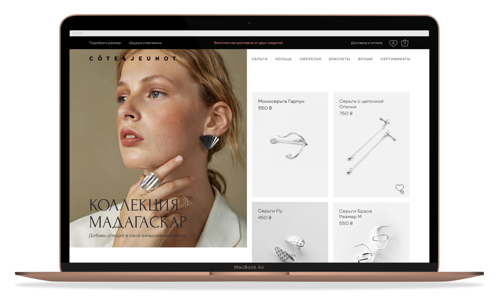
Cote & Jeunot ukrainian jewelry allows you to express the whole variety of feelings, avoiding platitudes. Ideal for a period of life when you want to have something special, not boring and at the same time affordable in price.
The main idea is to make the home page more functional and to immediately introduce customer/web page visitors to the brand and assortment.
The main idea is to make the home page more functional and to immediately introduce customer/web page visitors to the brand and assortment.
Colors
Forum
I used black color and large bold typography in the design to emphasize the photo of jewelry,
Font
TTTravels
Typography
I have chosen an elegant font and large typography for the site to convey the character of the brand.
Size
110 px
68 px
18 px
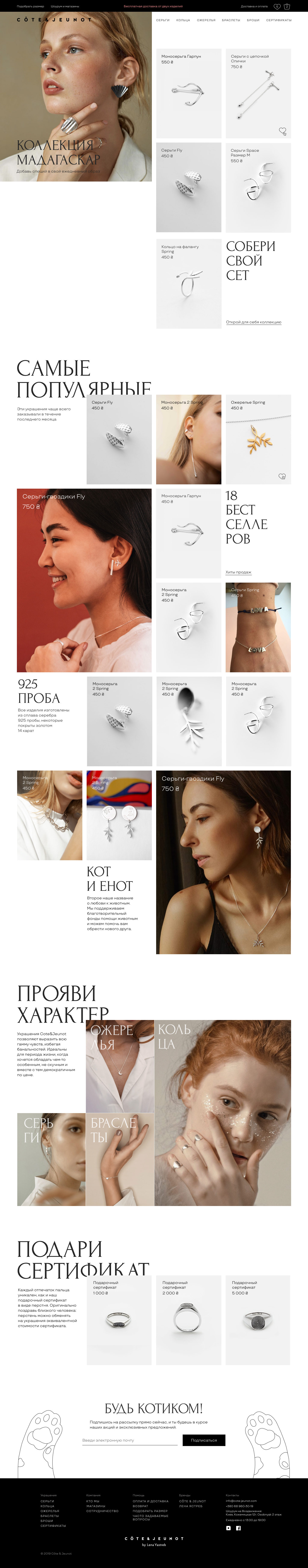
Main page
The block structure is convenient for navigating among many products. I used product cards of different sizes to help the user determine the viewing sequence. Also, to attract attention, some products are immediately shown on the model .

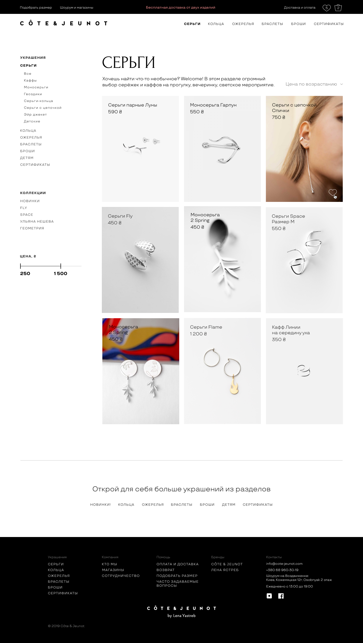
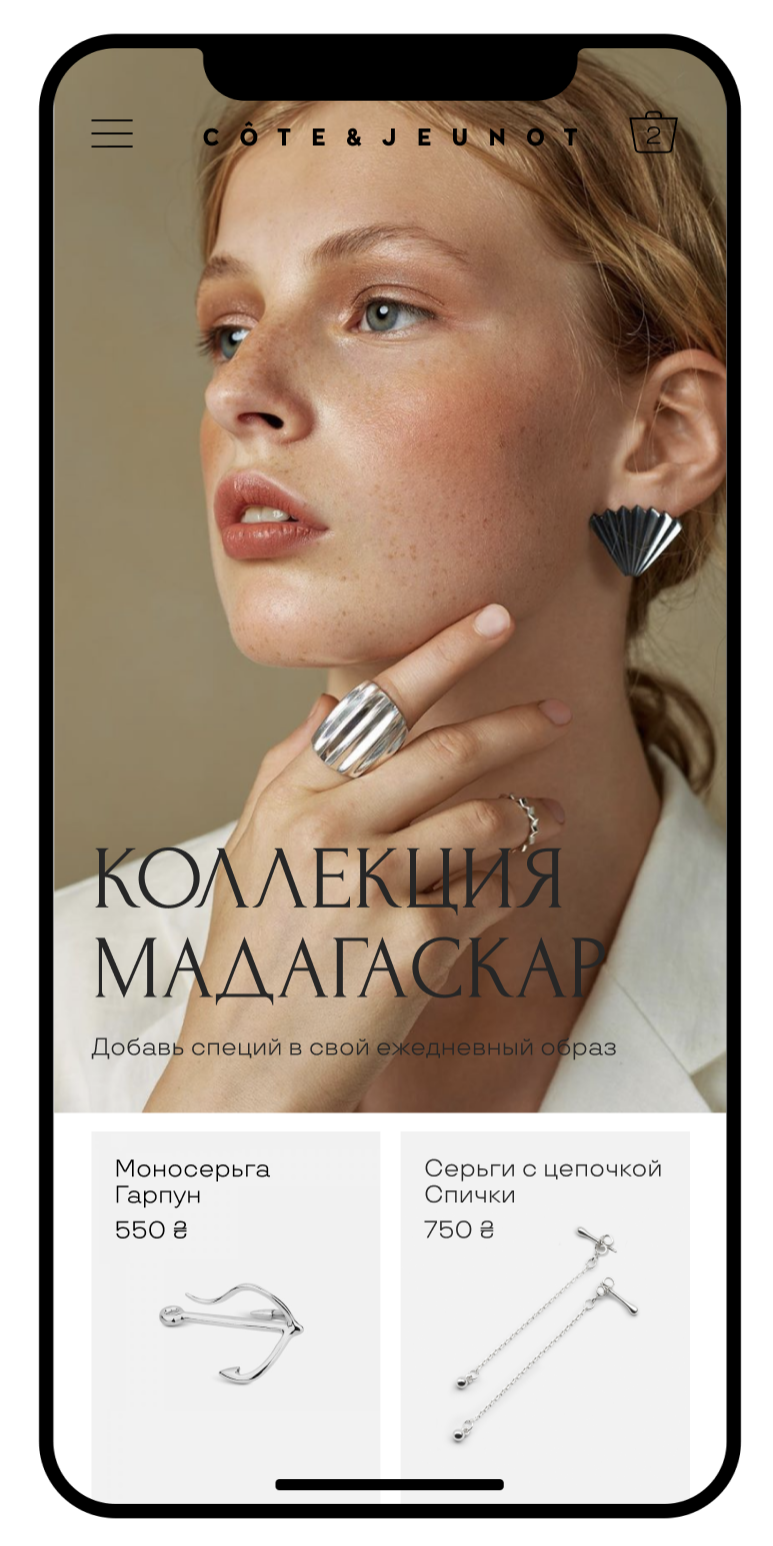
Catalog
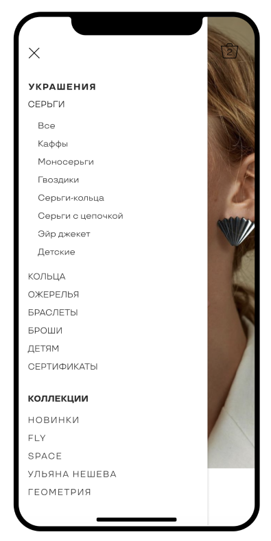
I added a detailed menu that helps to understand a large assortment and quickly find a product. In order to control attention, I show 80% of the products in the catalog on a gray background, and only where I need emphasis I show jewelry on a person.

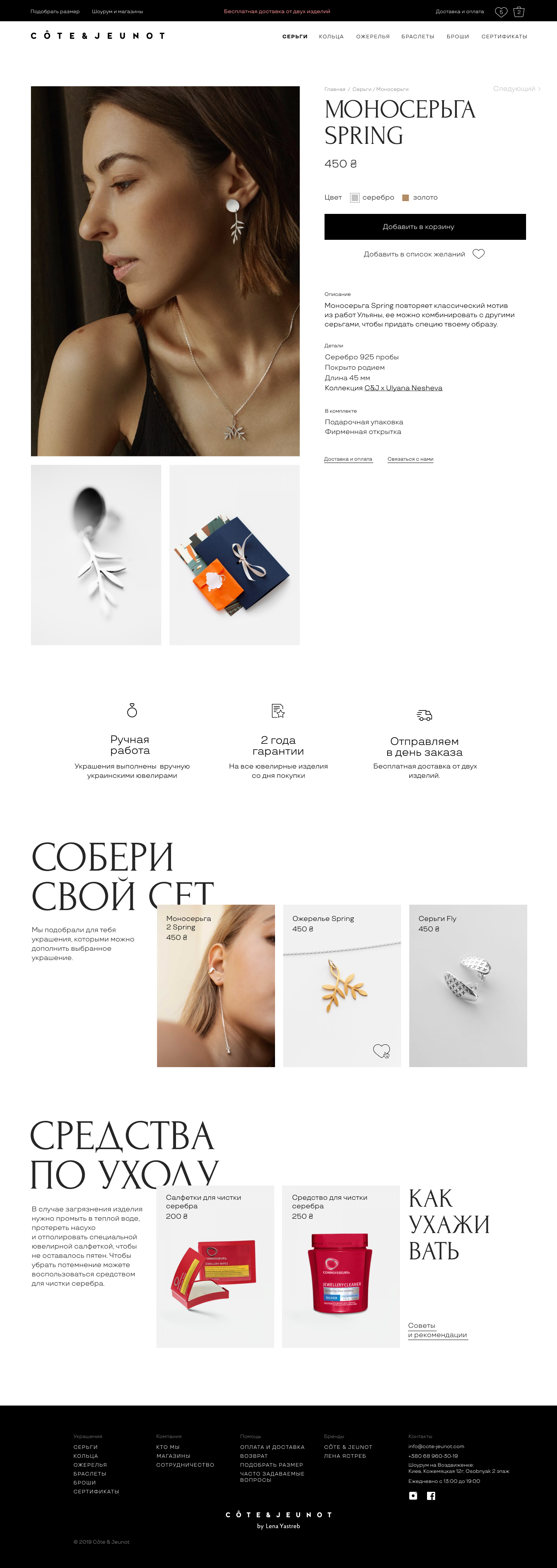
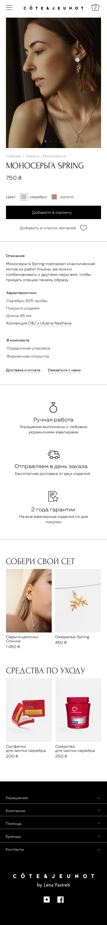
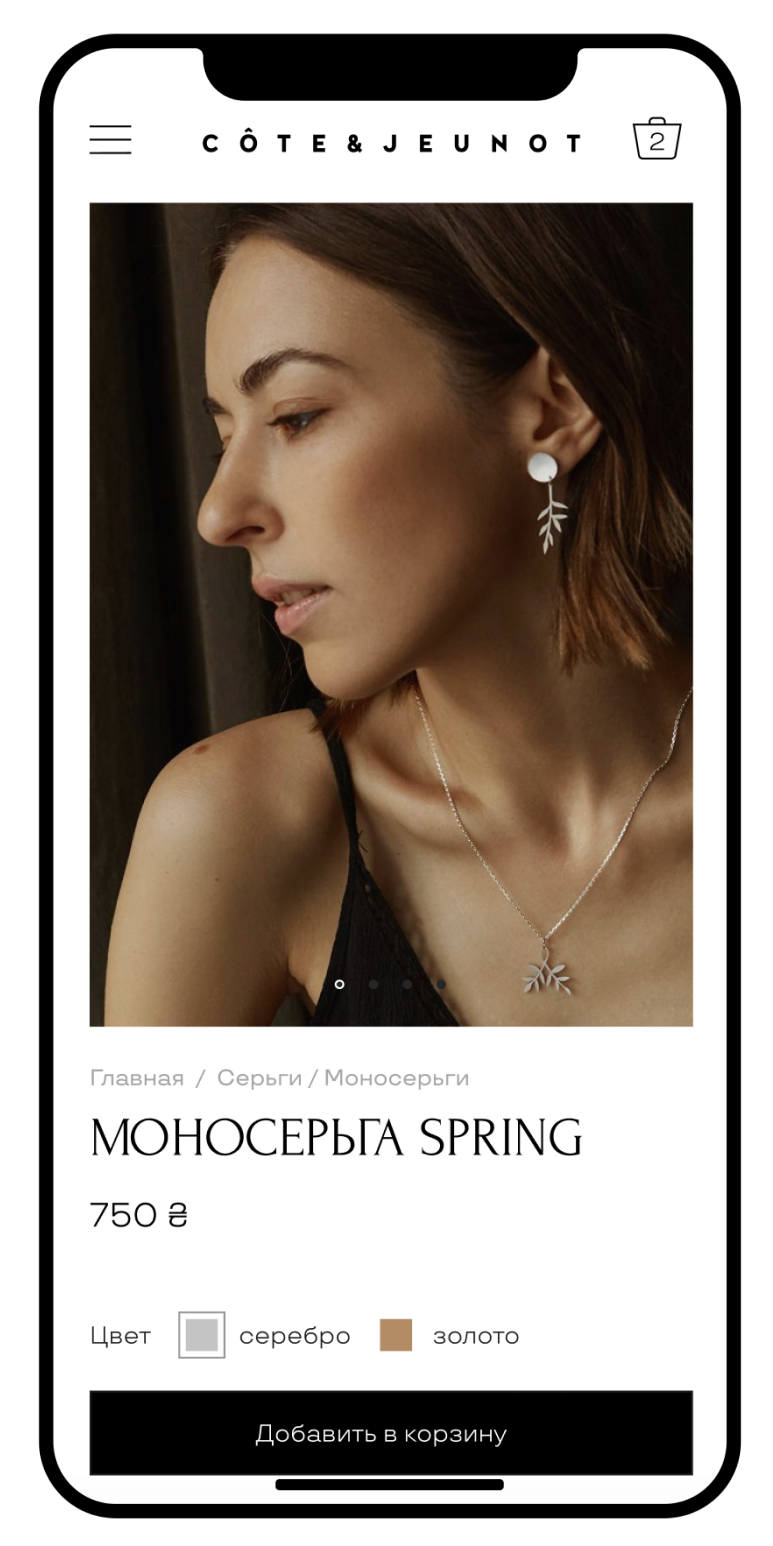
Product card
Here I structured the information about the product, added a scroll in the scroll so that you could see a large photo and read the text at the same time.
Added a floor with care products that can raise the average bill.
Added a floor with care products that can raise the average bill.